Do you know the difference between a mediocre presentation and an extra-ordinary one?
Mediocre presentation usually filled up with text everywhere. It uses bullet point as a standard template and often boring.
Whereas, an extra-ordinary presentation has the capability to catch the audience attention through pictuces that communicate, text that make you think, and has a strong message.
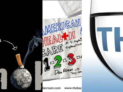
To see how the best PowerPoint presentation looks like, I have chosen 3 presentations, which considered as “The Best Presentation” in Slideshare.net
Enjoy and download below presentations for your reference.
1. SMOKE – The Convenient Truth
This presentation has won the 2010 Best Presentation Award in Slideshare.
This presentation talks about big impact of smoking and facts behind the cigarette fumes. It unveils the topic with interesting picture. The consistency of using simple colours palette creates harmonious presentation from the beginning to the end.
This world-class presentation contains limited text. By using the right picture and appropriate text, this presentation has the ability to connect directly to the audience.
SMOKE – The Convenient Truth [1st place Worlds Best Presentation Contest] – EP
Download This Presentation (38 MB)
It’s evident to admit that such presentation has great design, thus makes its creator as world class designer. From this presentation, you can learn how to present your ideas using a story, and describe it through pictures.
Besides, you could also learn the important principles in designing a presentation, such as contrast, harmony, repetition, alignment and focus.
2. American Healthcare – A4 Napkins Explanation
This presentation won the 2009 Best Presentation Award in Slideshare.
An interesting presentation doesn’t always use high-resolution picture or well-designed text. You can create a great presentation using simple sketch or illustration.
As you can see below, this presentation brilliantly uses simple illustration to describe a very complex issue. This presentation explains the relationship between healthcare provider, insurance company and people who use both services.
Download This Presentation (4 MB)
3. THIRST
This presentation won the 2008 Best Presentation Award in Slideshare.
The presentation explains how the world faces the thirst of clean water. The strength of this presentation is laid on the combination of using the right pictures and simple keywords. Therefore, this presentation is able to tell a story, which emphasizes the importance of water subsistence for human being and how our world is now facing the crisis of clean water.
From this presentation you could learn how to combine pictures with the right keywords to explain an idea.
Download This Presentation (8 MB)
What do you think?
What make the presentations above so specials?


