A good presenter will always try her best to deliver an attractive presentation. This includes how to present numbers in an interesting way. Those who often deal with numbers will surely want to have their numbers well presented, understood and appreciated by the audience.
In this article, I will explain how to present numbers to make your presentation more attractive. This article will also address frequently asked questions regarding how to present number in an effective way.
Questions:
I got a question from one of the readers, Edi Mantawijaya:
“How do I present numbers to be more effective?
To tell you the truth, I can’t avoid numbers, particularly in presenting a financial report which deals with numbers in a standard format.
Perhaps there are some tips to make it more informative, and of course more interesting? Thank you.”
Similar question comes from another reader, Tri Hariyanto:
“Almost every 2 weeks, I have to make a presentation which includes data and chart. Using different chart for different purpose has been explained in this blog. I want to know how to present data but don’t want to make it a boring presentation.
Thanks a lot!”
Answers:
Here are my answers.
Numbers is Different from Images and Words
The first thing you should remember is that numbers is different from images and words. If you present an image, audience could create an association. This is the strong point of using image. The same thing occurs with words. If you choose the right words your presentation will be powerful.
That’s images and numbers. How do I present numbers? As numbers have to be presented as it is, isn’t?
Help Your Audience to understand the Numbers Shown
Number is abstract thing. Nobody could easily imagine a number. Number is not only abstract, but also relative. Its value depends on another number being used as comparison.
For example, what is the meaning of 6% economic growth? For those who don’t have any economic background would think 6% is just a small number. However, this number is considered as one of the highest economic growth rate in the world at this time around.
Hence, you have to make the audience understand the story behind the number. Don’t just tell them that the prediction for Indonesian economic growth is 6%. Yet, explain that the 6% of economic growth is one of the best in the world.
Steve Jobs was one of profiecient speakers especially when presenting numbers. When he was explaining the capacity of an Ipod, he didn’t mention 1 gigabyte, 2 gigabyte or 100 gigabyte. Why? Because those numbers were abstract to the audience. Instead, he explained that you could store up to 1000 songs in your pocket. The number then had a meaning and a story.
Steve Jobs also said that 5 million songs were being sold every day on iTunes, which seems a big number to the audience. To make it easier for the audience to understand, Jobs gave an analogy that the number is equal to 58 songs sold every second of every day. Now the audience can imagine the number clearly. That’s the story behind the number.
When you present numbers, try to bring up the story behind. Don’t simply say that the sale of our product has increased 20%. But, explain that the number represent a combination of our 3 closest competitors. The number then becomes meaningful.
Use A Simple Chart to Present Numbers
A presentation should use simple chart rather than pointing directly to a table. Table is difficult for audience to understand right away, unless they have information about it beforehand. You certainly don’t want your audience to frown because of the way you present the numbers.
Transforming numbers into a chart would help the audience to understand better. The numbers will no longer appear abstract, but becomes visually comprehensible because there is comparison.
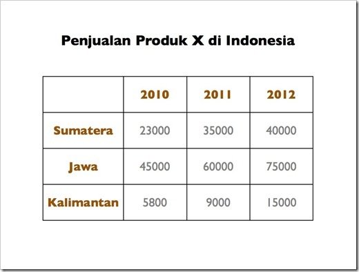
Here is an example. The following slide shows a table which presents sales of a product in numbers. Such data would not be readily understood by the audience. Only those who are good in counting could do the comparison. Though, it would take time to come out with a conclusion after analyzing these numbers.
X’s product sales in Indonesia
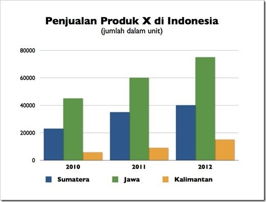
Now if you compare the same data but presented on a simple chart, the data would be more comprehensible. The actual numbers are not important, but the chart emphasizes the comparison between numbers.
The audience immediately becomes aware that the highest sale is in Java, followed by Sumatera and then Kalimantan. The audience should also be able to see instanly that the increasing sales in Java from 2011 to 2012 is almost in the same amount as the total sale in Kalimantan in year 2012.
X Sales in Indonesia
(By unit)
What if for some reasons you have to use a table to present your data?
Designing a table would be more effective by highlighting the important parts of the table, in line with its purpose.
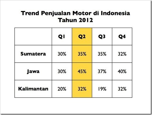
For example, the table below shows an increase in the sales of motorcycle by percentage on a quarterly basis.
You could see from the highlighted table that the second quarter represents the highest growth rate of all islands in Indonesia. The purpose of the highlight is to make the audience understand the message easily and guide their eyes to focus on specific information.
The Trend of Motorcycle Sales in Indonesia
In 2012
How do I Present a Financial Report?
In relation to accounting, sometimes numbers could not be presented on a chart or graph. There are also times when you can not avoid presenting numbers as it is in a financial report.
So how to make it interesting?
The answer is to make the numbers concise, and only show the numbers which are important for the audience to recognize. It is unnecessary to show the entire numbers. The audience would find it hard doing the counting and at the same time listening to the presentation.
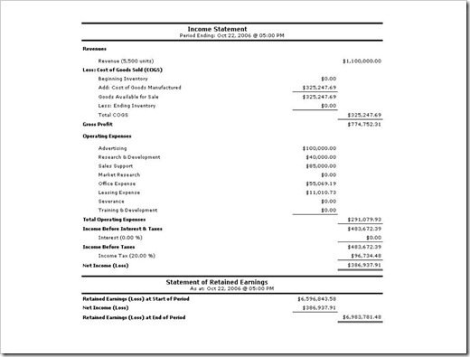
You can see in the example below, a slide presenting a complete financial report full of numbers in small font. Obviously, the audience would have difficulty to observe and understand the numbers. In this case the numbers become meaningless in the actual presentation.
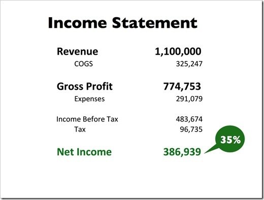
Most likely the presenter has no intention of going into the details in presenting the financial report. Perhaps the presenter only needs to emphasize certain components such as Revenue or Net Income.
The following slide shows the same financial report, but in a version that is brief, clear and to the point. Using this way, you only show important numbers to be recognized.
This slide only focuses on the numbers pertaining to Revenue, Gross Profit and, particularly the Net Income. An additional note of 35% indicates that the value of Net Income comes from 35% of the Revenue. Actually, this is the key message that the presenter would like to convey.
Therefore, handouts which contain the details could be disseminated to the audience.
A Combination of Image and Number
You could project a powerful and dramatic number if you are able to combine it with the right image. Through this approach, you create a visual association with the number being presented. Here is an example from Thirst Presentation by Jeff Brenman, who won an award as the best slideshare presentation in 2008.
You could see how this slide uses a powerful image and just a simple number. This kind of slide is perfect if you wish to convey a message with simple number in a powerful way.
Otherwise you could use a chart to show the comparison. Choose the right chart for explaining your slide.
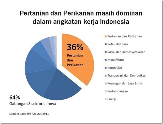
The following slide shows the Indonesian labor forces in the Agricultural sector compared to those in the Fishery sector. You could see that the data only highlights the sections that we are supposed to focus on, namely the sectors of Agriculture and Fishery.
The number of Indonesian Labor Forces is still dominated by the sectors of Agriculture and Fishery
- Agriculture and Fishery
- Retails and Services
- Public and community
- Manufacture
- Construction
- Transportation and Construction
- Finance and Business Services
- Mining
- Energy
36 % belongs to the sectors of Agriculture and Fishery
64% belongs to the other 8 sectors
Hopefully, this article could help you to present numbers to be more attractive.
If you wish to learn how to use a graph correctly for a presentation, please read this following article.
You can also learn how to present a graph effectively, and highlight on the important parts of the data.
I wish you good luck for your presentation by presenting data and numbers in an interesting way.
Don’t forget you can also learn how to present inspirational slide here.





Hi Mr Noer: Do you have any fantastic presentation on land plotting..
Love the example about financial reports.
There is a nice book called “Read This – Business Writing That Works” that shows a lot of brilliant examples of how use of white-space and formatting to create the kind of result you showed.
I have written a step-by-step guide on creating good tables for people who have raw-number data in front of them and want to do a good job for their presentation. You can find it here:
dansteer.wordpress.com/2013/09/10/make-effective-tables-for-your-presentation-8-simple-tips
Thanks fo this post!
@dan_steer
Hi Dan,
Thanks for your appreciation. Also sharing a great book and your article.
THIS IS REMARKABLE!!!